
Liquidity Report - December 6th, 2023
Liquidity Report - December 6th, 2023
A (somewhat) regular liquidity update

It’s been a few weeks since I’ve been able to do a Substack post on liquidity, so this one will be a bit different. This iteration of the report includes a broad analysis of liquidity as it has changed since the November 13th report.
Fed Total Assets (WALCL)

Current balance: 7,796,145 Million USD
Change since last report: -64,546 Million USD
Thoughts on Fed Total Assets
Nov 15th was the last reported roll-off of USTs on the balance sheet, and the last two weeks have seen a small increase in the UST balance. In other words there has been about a two week window of opportunity for the market to rally without any pressure from QT, other than MBS reductions at about 16B. Its no wonder that yields have found an opportunity to decline at a fast pace.
Taking a look at TLT with dates where UST roll-offs were reported shows that the rally has sustained through a couple of rounds of QT, with small dips followed by a pretty nice rip to where TLT is today.

The bank loans (WLCFLL) have also significantly slowed their roll downhill in the last 3 weeks reported on FRED. Taking a closer look at the weekly data we can see that we’re in a 3-week flatline period for the loans balance.

Each bar represents the one week change for the balance which has gone down almost every week by at least a few billion. Contrasting these bars with the weekly CBDEO bars shows that the last three weeks have been very positive for liquidity flows. There are many more variables in CBDEO that account for this rise in liquidity levels, but the lack of loan repayments are a noticeable contributor to this, and a factor that has played a significant role in adding to the tightening pressure over the months since the loans peak in March.
To summarize this section in one chart, here is a side-by-side of WLCFLL (loans) and WSHOTSL (USTs) showing the lack of QT in recent weeks.

It should be clear from this data that QT and repayment of bank loans has been having an effect on liquidity and markets. The ability for the current rally to continue unabated is likely supported by these (lack of) flows. This is supported further by liability flows, which is covered in the next section of the report.
Fed Liabilities
Rather than looking at FRED charts of the individual liabilities, a look at the combined TGA and RRP signal can help to visualize the total flows from liabilities instead.
The outflows from RRP+TGA have been immense, but it is worth noting that RSI went into oversold territory on the weekly, and from a technical analysis point of view, the level at which this combined balance is bouncing looks like a major support.
There may be fundamental reasons that the TGA remains relatively flat from here for a while as the treasury has reached its balance goal of about 700-800B, but RRP has become a hot topic, and many analysts and/or traders seem to think it should keep current pace all the way to zero. As a staunch contrarian, of course I have to be the one to provide a challenge to this view, at least for the month of December going forward.

Looking at RRP on the weekly time frame with RSI, it is clear that we’re in oversold territory, which in this case means “over-outflow” territory. Of course this could go even more oversold, but take a look at the last two Decembers. What was going on there? December 2022 marked the very top for RRP, and it might be theoretically sound to assume the flows were due to tax loss harvesting sales. This could explain why all the liquidity rushed back into the market in January 2023. However, we’d have to contrast that theory with a different one for December 2021, which would have been a year of gains. Still it might make sense to see some selling at the end of December as portfolio managers recognize the risk of missing their goals if something goes wrong, and at this point it seems like a lot can go wrong. If I was a Wall Street fund manager who hit my quota already, I’d be the first to suggest backing out of risk, and holding cash in RRP for the rest of the year while taking off for the Hamptons until January. If this December repeats the pattern, then RRP could jump quite a bit from here into the middle/end of the month, signaling a mass sell-off of assets.
A counter-argument to that idea is that the Fed is signaling rates have peaked, and this liquidity is looking for places to go to capture returns for longer, meaning liquidity diverted from RRP to bonds. This has especially shown up in bond yields recently, with the 2-year yield going below its 200 day moving average.

This almost looks like a replay of the bank blowup from March, but this time it seems like the market is giving us a more complex hint that it believes in a soft landing. Lately yields coming down results in stocks and risk assets moving higher. For example take a look at IWM (Russel 2000) vs the 2-year yield:
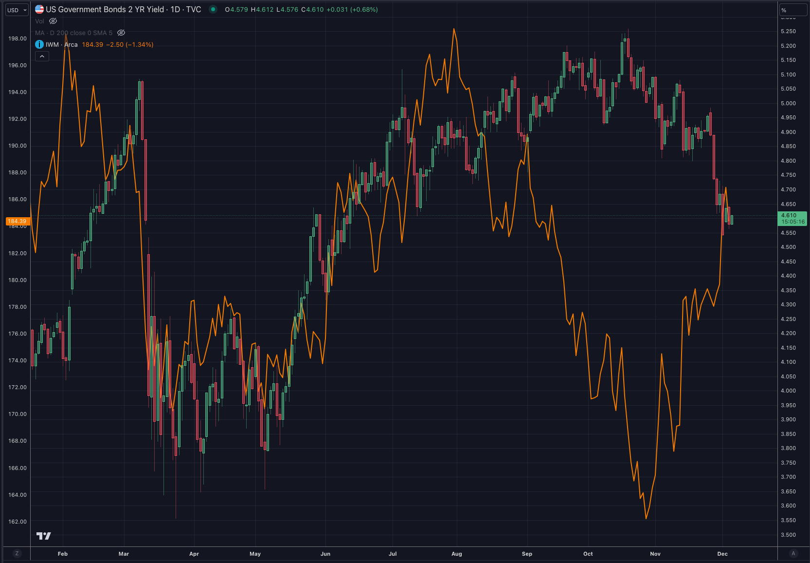
Notice anything different between the March 2-year yield drop, and today? When yields were rising after the bank loans, the market began to believe in “Higher for Longer”, and it sold off into higher rates. But now it’s a completely different story as rates drop almost as fast as they did in March. Instead of seeing this as an imminent sign of recession and problems ahead, the stock market is taking it as an opportunity to flock back into risk.
There has hardly ever been a time in history that I can find in the charts where rate cuts coincided with bullish momentum continuing for risk assets. Rate cuts from the Fed, and big drops in rates in the bond market are a signal that suggests things are breaking down in the economy. Not only this, but market participants with what little liquidity they have left when QT is getting close to fully draining RRP, will likely choose safety over risk. Rates such as the 2-year going down represent this shift in liquidity, and it is likely why stocks are having difficulty going to all time highs, even as liquidity flows have become so positive the last few weeks.
Regardless of my understanding of history and what I think these signals mean, we still have to respect what the market behavior is, and recognize that a blowoff top is possible. I’ve stated why I think this will be dangerous going into 2024 in a recent thread on X:

A blowoff top would represent the market belief in a soft landing, and that we should all go all-in on risk from here. If the market broadly believes a new bull market has started, who wants to be left behind, playing it safe? Based on current market behavior as shown above in the IWM chart, the market is communicating that a blowoff usage of the remaining liquidity in our reserves (RRP) is a likely scenario to play out. I would bet there are even participants who don’t believe in the soft landing that will still want to play it this way. I could imagine it all being a self-fulfilled prophecy between the media and all the participants that are cheering for new highs, even for just a brief moment at the chance of being the first one to perfectly time and sell the top. But what if there were signs already telling us the cracks in the dam are too hard to ignore?
Non-US Central Bank Assets
It’s not surprising that the DXY took some punches over the last few weeks with liquidity roaring out of the TGA and Reverse Repo.
The dollar typically follows a lagging pattern that resembles the moves in the TGA. My theory for why this is the case is simply one of supply and demand dynamics. Increases in the TGA represent the trapping of liquidity, or a decrease in dollar supply for the rest of the world to utilize. In other words a buyer of a treasury gives up dollars for a bond. This is another reason yields play a crucial role. If yields drop like they have recently, it represents those bonds held by the lenders being worth more dollars, hence more USD based liquidity on non-US central bank balance sheets, strengthening their currency.
The chart is looking bouncy for now, but the bad news for the DXY is that the TGA just dropped again, back to 681B from a recent high at over 750B. This is somewhat expected due to it being early in the month. It is possible that the flows will be more tame for the rest of the month and stabilize the balance around 750B or so.

One of the bigger developments in currencies recently has been in the USDJPY pair

The BoJ seems desperate these days to keep their yields low, and the most obvious reason for this is the fact that there is heavy leverage in the carry trade. When the trade unwinds we see USDJPY go down, and in some cases stocks or other assets being sold off as well. This behavior is sometimes more noticeable in the overnight session as pointed out by DarioCpx on X:

The full post is worth a read, and I highly recommend DarioCPx’s other JPY related posts for more details. I will be hosting another space with DarioCpx soon so stay tuned for that on X as well. We will dive deeper into this topic.
Bitcoin
The laser eyes are back! New bull market? Or is it easily explained by liquidity flows recently?
To help answer this, I created WRESBAL Plus on TradingView. By combining the variables that make up the WRESBAL equation with data streams that are more up to date, this indicator provides a much more accurate liquidity picture as it relates to pure liquidity asset plays such as Bitcoin.

Based on the recent flows it is apparent that Bitcoin is simply following this liquidity metric, which has rallied recently as a result of TGA withdrawals and RRP ejections.
I think the question now is where will WRESBAL go? It can climb as long as outflows from liabilities (TGA+RRP) outpace the drawdown of the assets side of the balance sheet with QT and bank loan payoffs, so ultimately it goes back to my rant in the earlier section regarding RRP, given that the TGA ranges from here for a while. In the past, when BTC has a great year, the end of the year tends to be the finale and blowoff. We seem to be playing out a similar scenario now. The eventual fundamental downfall could be taxes being due in 2024. Of course the Treasury loves this, as they are poised to collect big-time going into April, but this also means the TGA will see similar boosts as it did in 2022 where the market sold off heavily to cover the bill. I believe the market has positioned itself for this very scenario.
Conclusion
The pace of QT and loans being paid back down on the Fed assets side has been significantly slower for a few weeks, opening up a window for liquidity to splash into the markets. Risk-on is back just as recessionary data seems to be building further, and the bond market is signaling a start to the safety trade. A potential blowoff scenario is in the works if RRP drains fast and all the juice is used to pump the casino full of euphoria. New indicators like WRESBAL Plus will help us navigate the moves along the way.